
Color is an integral part of our lives. It impacts the decisions that we make about the clothes we wear, the cars we drive and, most especially, the way we decorate our homes. Even in today’s modern, open floorplans – where kitchens, living rooms, and dining rooms are often one large space – color is used to help define interiors and create focal points in rooms that are relatively featureless. Of course, the trick is to figure out which colors to use and where to put them.
Using Color Architecturally
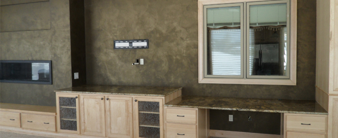
One of the most effective ways to use color to transform a room is to play up its architectural features. Molding, mantels, built-in furniture, arched doorways, wainscot, windows, and doors all offer an opportunity to add another layer of interest to colored walls.
For subtle emphasis, try painting molding or doorways just one step lighter or darker than the primary wall. It will create a subtle shift in color that really brings your eye to the detailed craftsmanship of the wood trim. Painting a metallic glaze right on top of an existing painted element, like a ceiling medallion, is another way to draw attention. A copper or bronze finish is quite translucent and gives a nice shimmer to and enhancement of an architectural feature.
For a bolder approach, try using two different colors in the same room. For example, paint a built-in bookcase or niche a shade of green in a room with blue walls, highlighting the items in the bookcase or inside the recessed area.
Of course, architectural elements can also provide continuity throughout a house if they are painted the same color in every room, such as white and off-white for molding, windows, and doors.
A room containing wainscot or bead board provides a fantastic opportunity for contrast between light and dark. A dark wainscot/bead board below a bright wall will draw attention to the upper walls, while a bright white wainscot/bead board next to a colored wall will focus the eye on the lower walls. You can also use paint to create the same effect without wainscot or bead board by covering the bottom third of the wall in one color and the upper walls in another; then place a piece of flat molding along the intersection and paint it the color of the lower wall to reinforce the look.
Where rooms are relatively featureless, creating an “accent wall” in a vivid hue where the others may be white or neutral can add a dramatic, contemporary edge. Or you can paint the primary walls a soft color such as beige or celadon green and the accent wall three shades darker. The accent wall still gives the room a focal point, but it’s not as dramatic.
If drama is your goal, consider nixing the idea of painting an entire wall from corner to corner and instead forego tradition by creating an original look that will enhance architectural emphasis where one naturally doesn’t exist. For example: Take a big wall and, working in from both corners, paint it almost to the center, leaving an 18- to 20-inch vertical line of white space, and hang artwork down the center.
Consider the ceiling the fifth wall of a room. Though sticking to white generally makes a space feel airy, a similar effect can be achieved by painting the ceiling a shade or two lighter than the wall color. Just take the paint sample card that has your wall color as the middle choice, and then go one or two choices lighter for the ceiling color. The result will be a room that appears larger, because the contrast between wall color and ceiling color has been softened. In a small room, such as a bathroom, the ceiling can even be painted the same color as the walls to make it look bigger. In a house that has ceilings just 8 or 9 feet high, painting a bedroom ceiling a pale robin’s egg blue, for instance, would be a way to create a similar, soothing effect.
Painting to enhance the architecture can add depth and life to an ordinary room, while giving flare and focus to certain areas of your home. Be sure to check back next week for Part 2 of Color 101, where we’ll discuss tips for choosing the right colors and offer up some common mistakes when choosing colors.
*image courtesy of Mark Nordgren/Flickr